
Help
On a phone
What changes at phone width, and what to leave for a laptop.
Every section works at phone width. This is what changes.
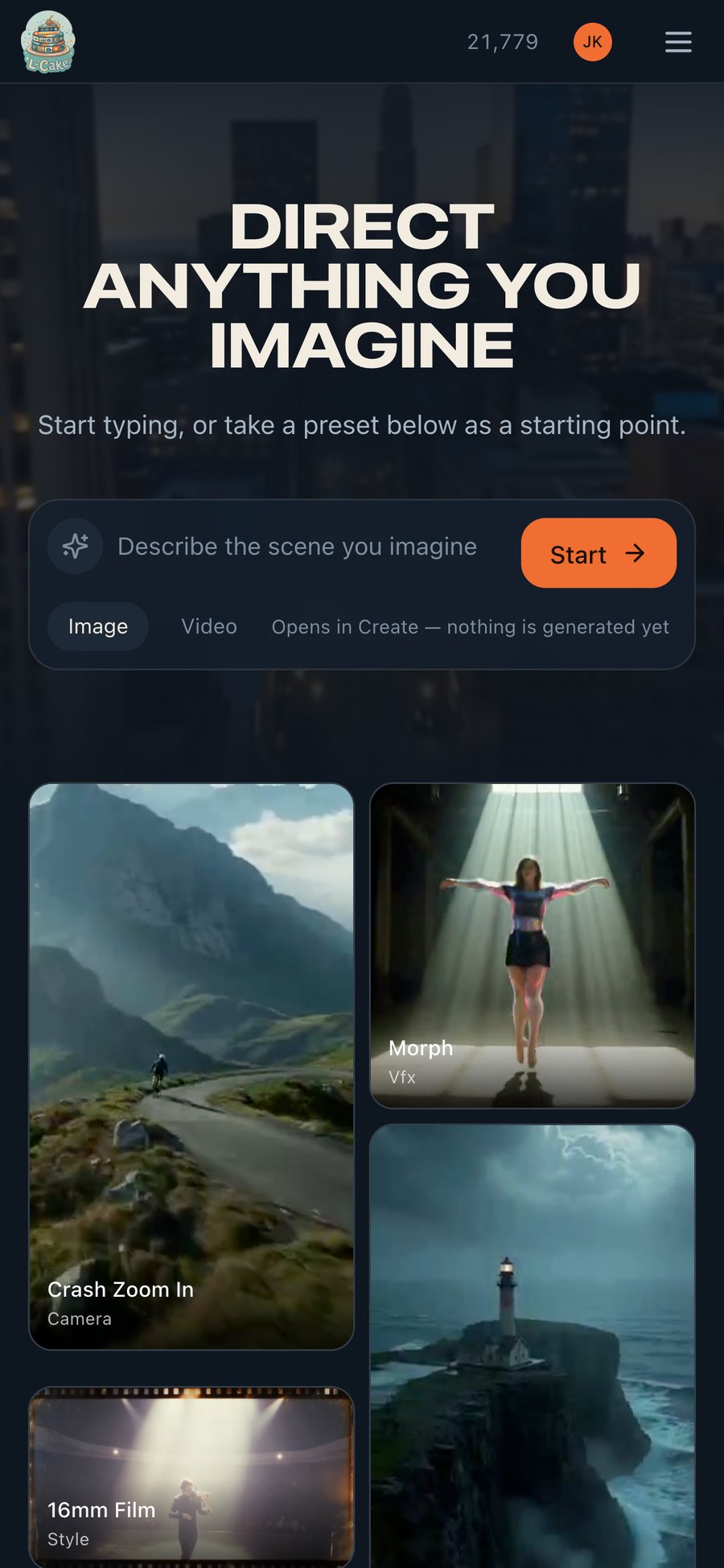
The composer
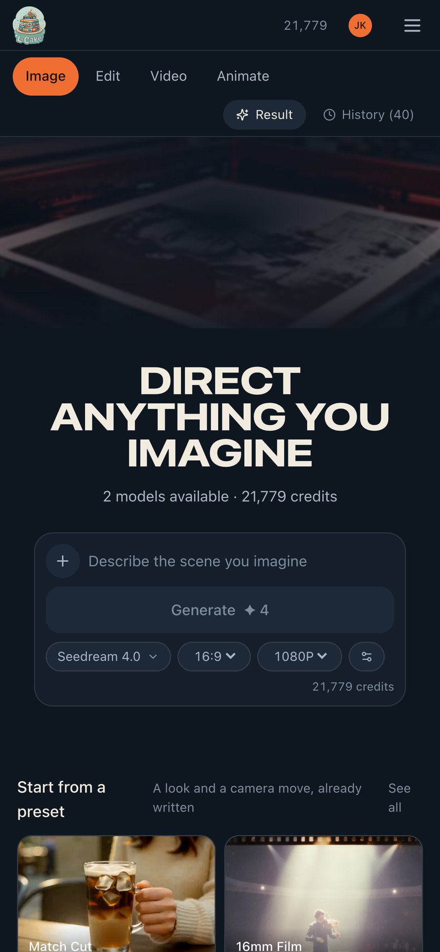
In Video and Animate the settings stack above the canvas rather than beside it, and the mode strip leads rather than sitting below the whole form — otherwise there is no visible way back to Image without scrolling past every control.
Effects and Voice
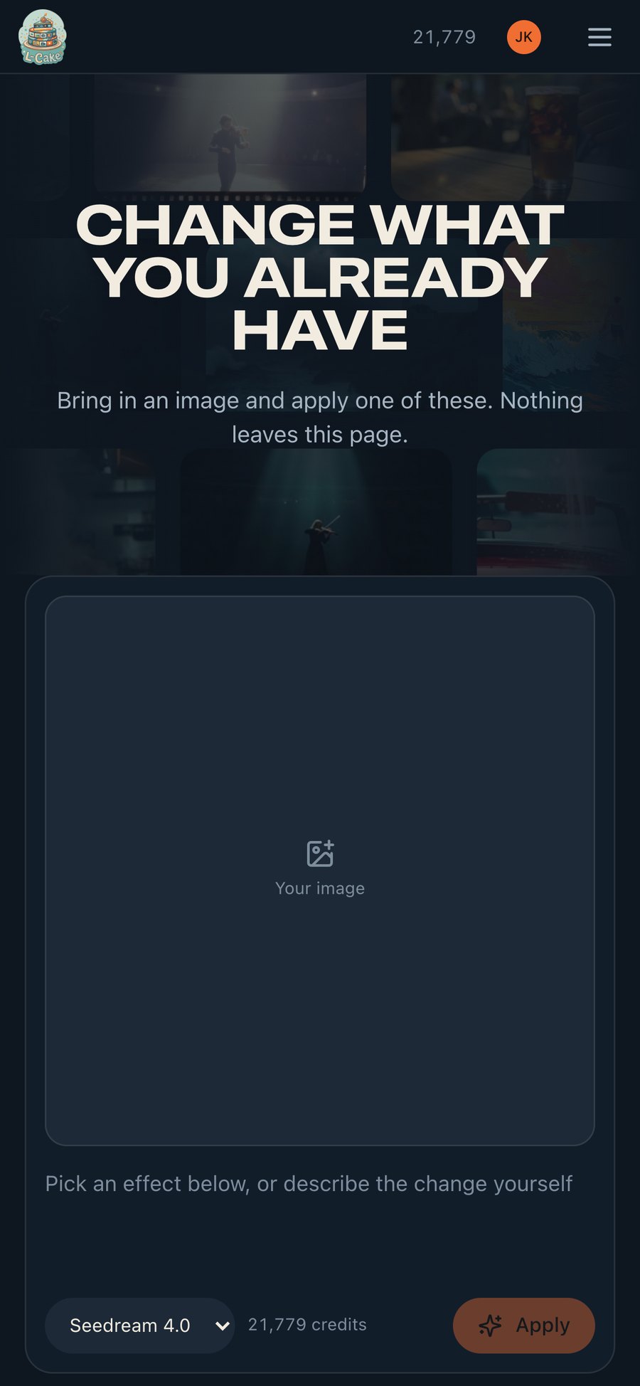
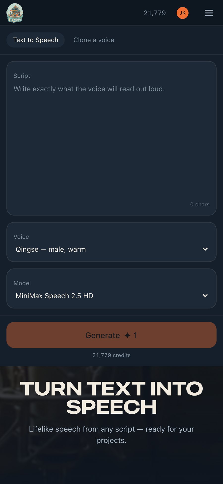
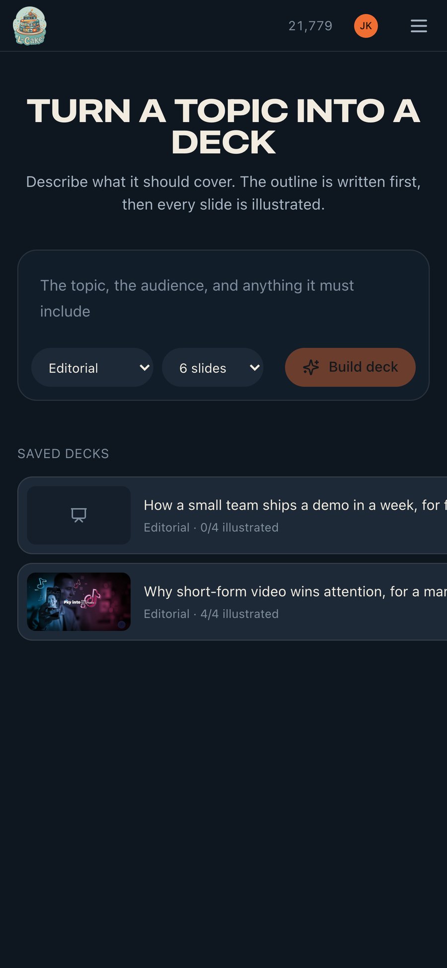
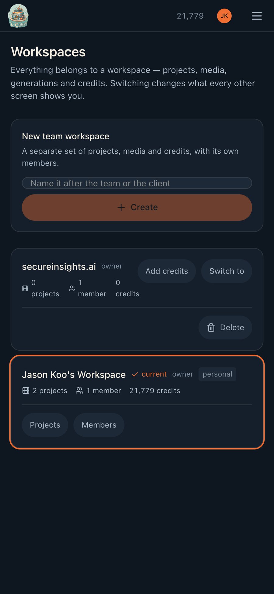
Slides and Workspaces
What to leave for a laptop
The timeline editor
It is four panels and a frame-accurate drag surface. It loads and it works, but trimming a clip to the frame with a thumb is not something anyone wants to do.
Everything else — generating, applying effects, narrating, building a deck, managing a workspace — is meant to work on a phone, and does.